


Map Making Tutorial
Friday, July 11, 2008
I posted a couple of custom D&D maps over on Story Games and some people there asked me for a tutorial for making them. So here ya go!Step Zero: Set up your map sheets
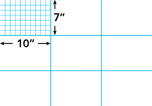
The fist thing to do is set up your Photoshop file at the right size so it will be easy to cut into printable sheets later. I use 7x10" tiles as my base size, since they easily fit on 8.5x11" cardstock for printing. For this map, I decided I wanted a 3x3 sheet map, or 30x21" (at 150dpi).
Step 1: Block in the shapes
Once the file is set up, I block in the shapes for the map using the Pen tool. I do these as vector shapes so they'll be easy to edit later if I need to. For this map, I'm not using a battlemat grid overlay (except for a few bits of the third floor) so I want to use a 1" background grid in PS so I can easily have the vector points snap and keep everything nice and aligned to the game grid.

(click for big version)
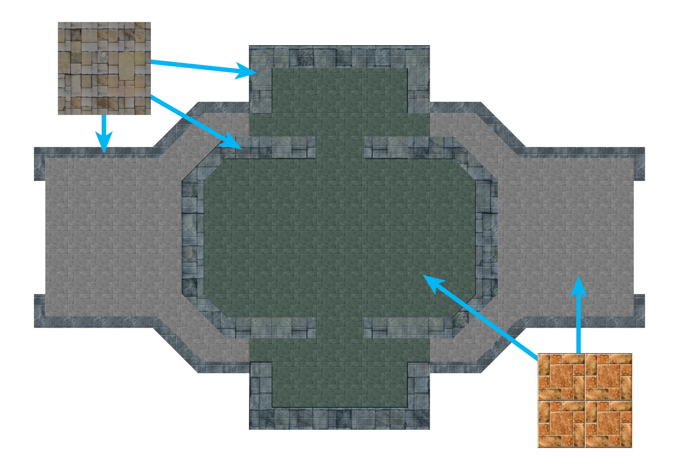
Step 2: Apply textures
There are many great sources for textures on the web. The trick is to size them to your grid size (I'm using the stone floor texture at a scale so the stone tiles are 1" across and will double as squares for the game grid). You also want to color them and mess with saturation and levels until they have the look you want. You don't ever have to use a texture "as is."
(click for big version)
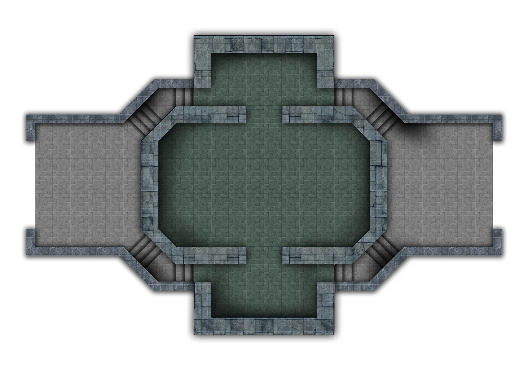
Step 3: Shadows!
Adding shadows is arguably the most important part of making a good-looking map. Without shadows, a map is flat and dull. With good shadows and lighting effects, your map will come to life. At this stage, all I've done is add layer styles to my underlying vector shapes. In this case, Drop Shadow and Outer Glow (black, set to multiply).
(click for big version)
Play around with settings until it looks natural (the default Drop Shadow sucks). I also go in with a soft brush and hand paint shadows here and there to add some dimension to things (set your brush to a low Flow value so you can build up the shadow in stages instead of plunking down a big blob of black). As you can see, the "stairs" are really just little strips of gradients. The contrast of the light edges against the shadow is all your eye needs to see a staircase.
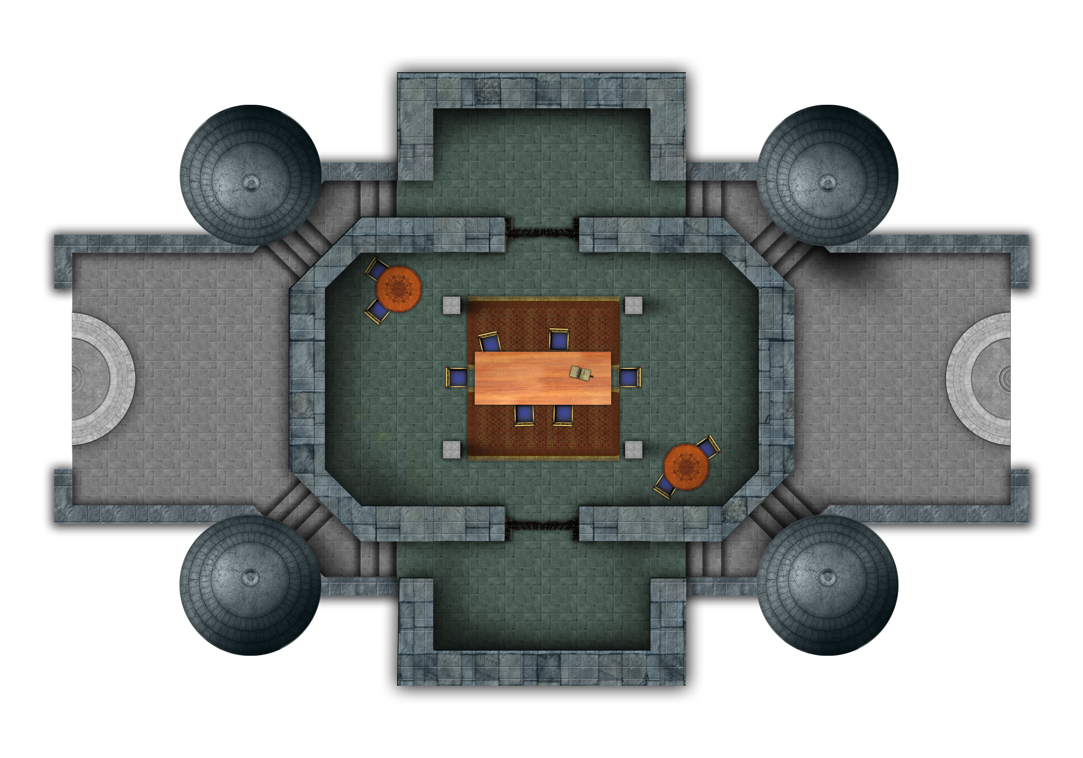
Step 4: Map objects
Now we start adding map objects like towers, tables, chairs, rugs, etc. RPGmapshare.com is a wonderful resource for this kind of thing. I get almost all my map objects there, supplemented by Google Image Search.
(click for big version)
Adding shadows and tweaking light and colors is just as critical here. You want everything you add to feel like it fits into the design scheme of your location. Tables and pillars should cast shadows (just a few sweeps with a soft brush). The towers are somewhat conical, so they get areas of deep shadow on their dark sides. This step of customizing and shading your map objects will take up the bulk of the map creation time.
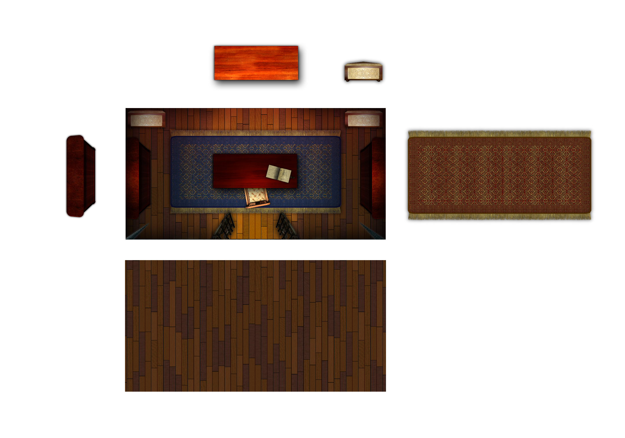
(click for big version)
Step 5: Background and little touches
This is a tall tower, so I want the background to look like it's far away. I grabbed a few pretty terrain screenshots from CRYSIS (the video game) dropped them in the back, and Gaussian blurred them a bunch. A few touch ups and that was done. Then I started adding all the little bits to give the location some character. Gates on the landing platforms, little wooden ledges and ropes that the windship crews use during docking, stairs in the main hall that go up to the gallery and third floor, fireplaces (with reddish glows on the floor), and other details.
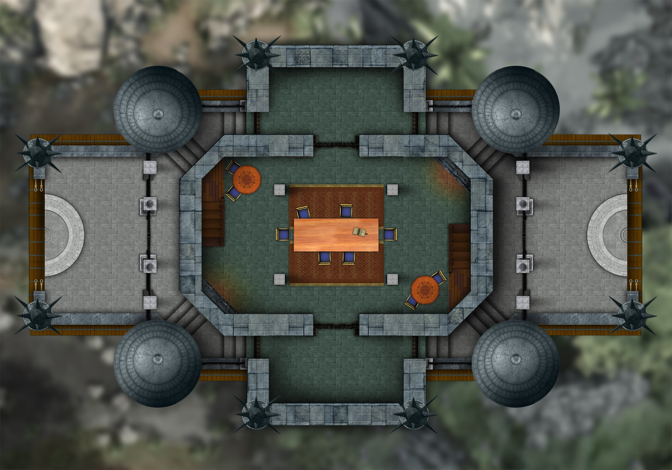
(click for big version)
Step 6: Levels Two and Three
There's a gallery that overlooks the main hall, and stairs up to a third floor, so I did those next. The edges of these floors align with the edges of my map sheets (7x10), so in play I can just put down a new tile when the PCs go up to the next floor.
Level 2 Gallery:
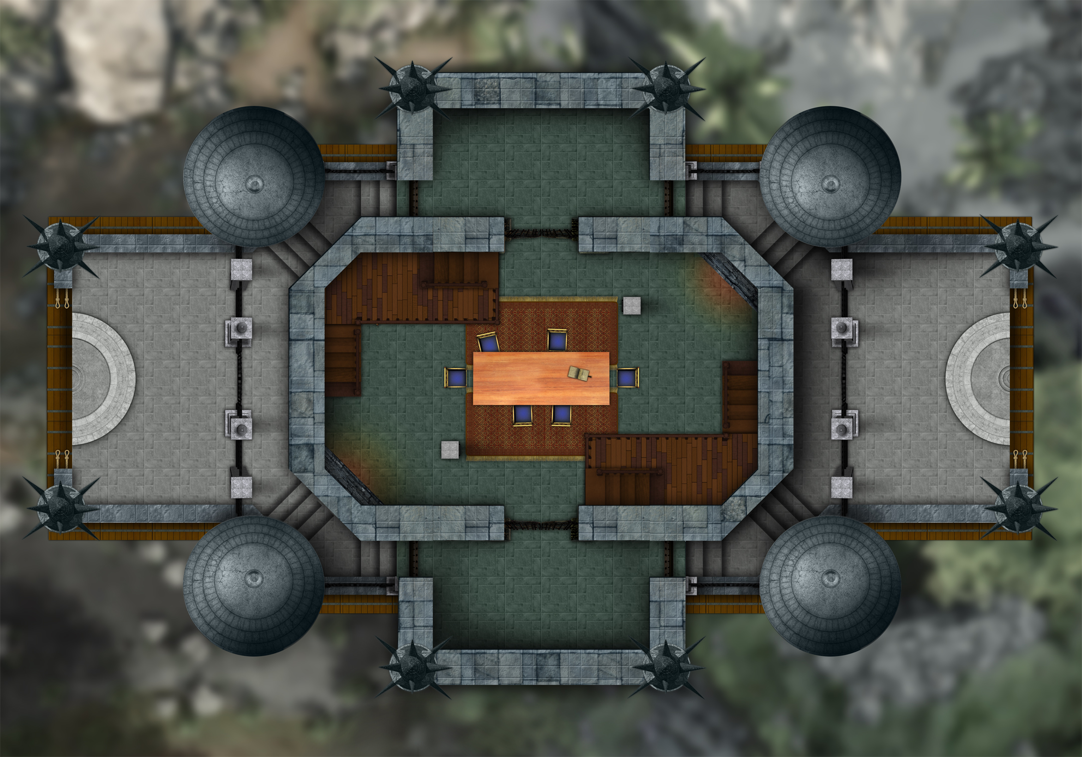
(click for big version)
Level 3:
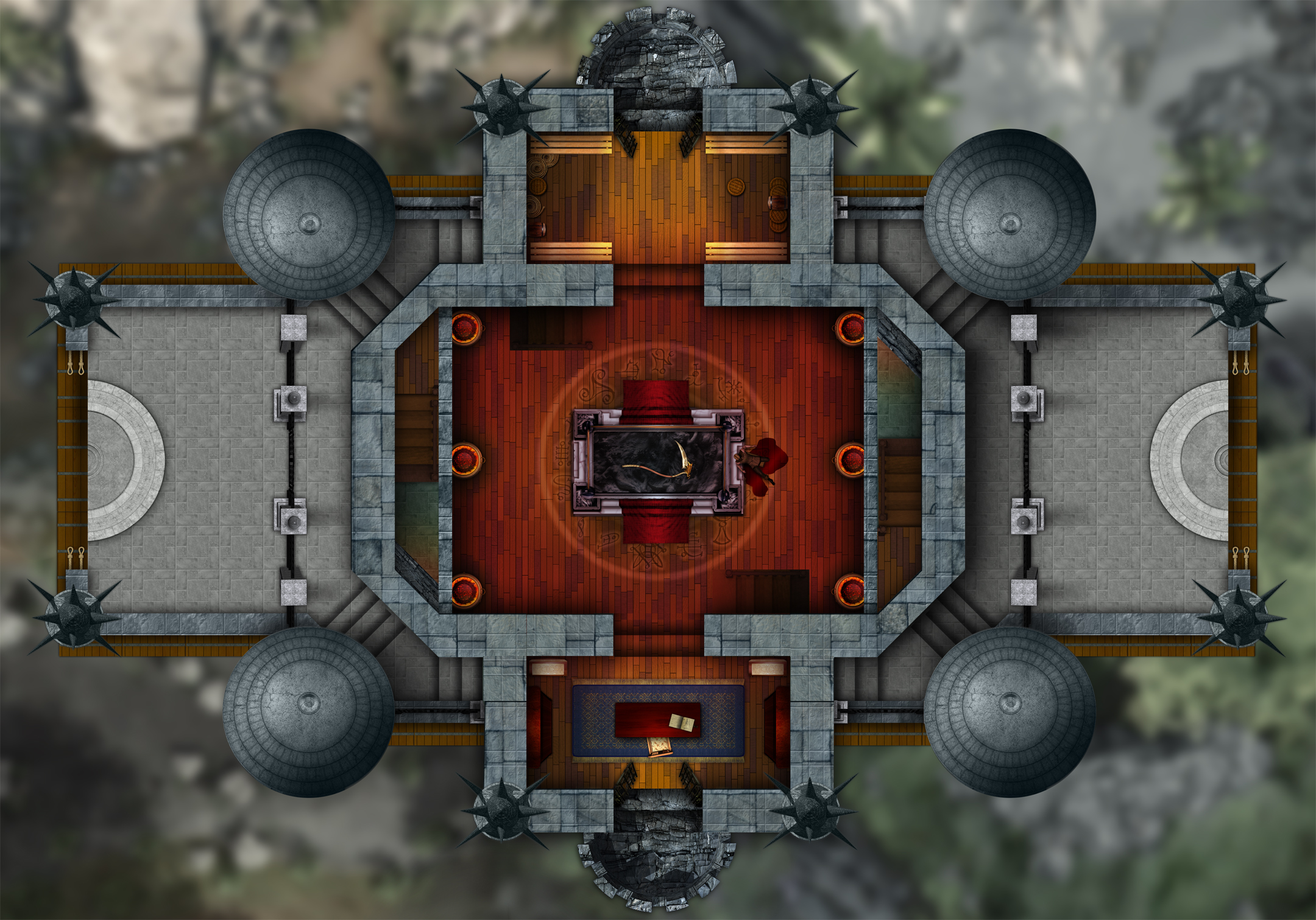
(click for big version)
And that's it. Like I said, you'll spend most of your time messing with lights and shadows and changing colors and such to get everything to gel. It's just something you have to eyeball, and it's hard to know when it's "done." I could easily work on this map a lot longer and make it way better. But, game night rolls around and the thing has to be ready for play, so there's a built-in deadline.
Here's the finished map in PDF form, all chopped up into tiles for printing:
Tower Mansion PDF (6.6M)
Enjoy! And let me know if this tutorial was helpful, if you have any questions, or if you make any maps yourself.
EDIT: Check out the comments for David Artman's tips on making durable, modular map tiles using transparency sheets.
7 Comments:
You are a graphic design god!!!
Nice overview. The only thing I'd add (in particular, for folks who print their own, using their own color ink) is to print on transparencies for the 2nd and 3rd levels, to avoid reprinting all the background and lower-level stuff. If you're REALLY clever (and I am), you could flip the images on the page and print to transparencies, and then when you place them as overlay, you cans till use dry-erase pens to mark up the (unprinted) back side, without risk of bad interaction with your printed ink. Hit up Kinko's to sheet-laminate the lowest level (obviating, incidentally, the need to use card stock) and you're done: markable, modular maps with minimal ink use.
Of course, if you expect the party to "split levels" often, you'd want some kind of blank, protective "backer" sheet for when a transparency isn't being used over-top of your laminated base sheet. Otherwise, your playing surface might scratch off the ink (remember that it's underneath the sheet, on the table surface!).
HTH--again, great tutorial!
David Artman
Those are great ideas, David. Thanks!
This is pure graphics gold.
Many, many thanks!
Excellent work.
Now try doing it in 3D Studio MAX.
Just gotta say that almost a year later, I'm still referring back to this as the standard tutorial. Thanks!
Great post i must say and thanks for the information. Education is definitely a sticky subject. However, is still among the leading topics of our time. I appreciate your post and look forward to more. high end drones
Post a Comment
<< Home