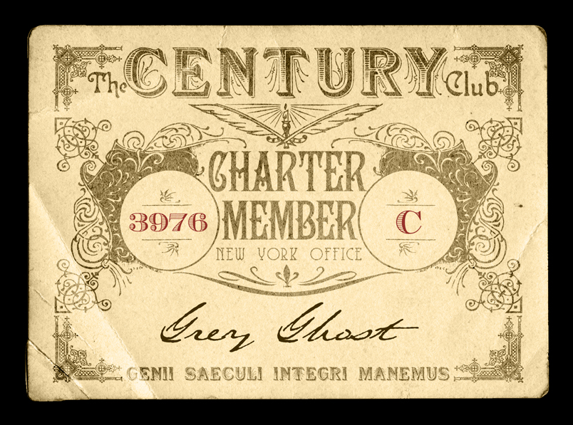
Fred made a Century Club membership card recently, and it inspired me to make one, too. Mine comes from a slightly earlier era than Fred's deco version.
STEP ONE: Visit the Morgue I have a gigantic archive of images grabbed from all over, plus royalty-free stuff purchased over the years for work. For this image, I browsed through the vintage blank card graphics I have, and found one that looked roughly membership-card like. (I think it's actually the back of a large photo or something.) The right aged look and slight bend on the corner go a long way to selling the idea of a real object, and will take some of the pressure off the graphic in terms of being absolutely era-perfect.
STEP TWO: Find the real thing. Whenever I do a vintage piece, I try to find a real example from the period to work from. Google Images is, of course, the best tool for such a thing. I found a few old-timey cards and got a feel for the look I wanted. I wanted a cross between engraved currency and a diploma, so I also browsed that sort of thing. Google Images is awesome.
STEP THREE: Typography! Like the image Morgue, I have a staggering collection of fonts gathered over many years of graphic design work. I used my handy-dandy font preview tool (FontGlancer) to try out "The Century Club" in a bunch of different faces until I found the right engraved look.
"Showboat," a freeware font by David Rakowski (via Dafont.com) turned out to be a good fit. Most of the fonts I used for the card are from Dafont.com, which is a pretty good source for free vintage-style typfaces. (Cthulhulives.org -- the H.P. Lovecraft Historical Society -- is another very good source for period fonts.)
I also used: Campanile, Isla Bella, Coventry Garden, Saeculum, and Ecuyer.
STEP FOUR: Ornaments! Actually, this happened at the same time as step three, but whatever. The vintage ornaments are from my archive, but I think most of these originated at Houseoflime.com. You can never have too many crazy Victorian, Deco, and Nouveau decorations lying around. I started with the corners of the border, using a nice engraved-looking thing, then worked my way in. The ornaments with the empty circles really made the whole thing come together, and once those were placed, I just massaged the type around to fit the flow.
STEP FIVE: Fool the eye Once everything was placed how I wanted, I set the type and ornaments layers to "Color Burn" to fade them and let the texture of the card show through. I also went in with a brush and scratched up the type here and there, but not as much as I might do on a piece like this. I wanted it to look old, but it didn't have to be totally convincing, so I left it more crisp and sharp than I might have. This last step usually takes the most time if you're trying to make something that really looks like an artifact, but I didn't go very far with it this time.


4 Comments:
This is one hundred different kinds of awesome.
Envy.
I drip envy.
Also: You should break down your construction methods, as I'm terribly curious (and wish to absorb the know-how into my own).
Sure thing, Fred.
STEP ONE: Visit the Morgue
I have a gigantic archive of images grabbed from all over, plus royalty-free stuff purchased over the years for work. For this image, I browsed through the vintage blank card graphics I have, and found one that looked roughly membership-card like. (I think it's actually the back of a large photo or something.) The right aged look and slight bend on the corner go a long way to selling the idea of a real object, and will take some of the pressure off the graphic in terms of being absolutely era-perfect.
STEP TWO: Find the real thing.
Whenever I do a vintage piece, I try to find a real example from the period to work from. Google Images is, of course, the best tool for such a thing. I found a few old-timey cards and got a feel for the look I wanted. I wanted a cross between engraved currency and a diploma, so I also browsed that sort of thing. Google Images is awesome.
STEP THREE: Typography!
Like the image Morgue, I have a staggering collection of fonts gathered over many years of graphic design work. I used my handy-dandy font preview tool (FontGlancer) to try out "The Century Club" in a bunch of different faces until I found the right engraved look.
"Showboat," a freeware font by David Rakowski (via Dafont.com) turned out to be a good fit. Most of the fonts I used for the card are from Dafont.com, which is a pretty good source for free vintage-style typfaces. (Cthulhulives.org -- the H.P. Lovecraft Historical Society -- is another very good source for period fonts.)
I also used: Campanile, Isla Bella, Coventry Garden, Saeculum, and Ecuyer.
STEP FOUR: Ornaments!
Actually, this happened at the same time as step three, but whatever. The vintage ornaments are from my archive, but I think most of these originated at Houseoflime.com. You can never have too many crazy Victorian, Deco, and Nouveau decorations lying around. I started with the corners of the border, using a nice engraved-looking thing, then worked my way in. The ornaments with the empty circles really made the whole thing come together, and once those were placed, I just massaged the type around to fit the flow.
STEP FIVE: Fool the eye
Once everything was placed how I wanted, I set the type and ornaments layers to "Color Burn" to fade them and let the texture of the card show through. I also went in with a brush and scratched up the type here and there, but not as much as I might do on a piece like this. I wanted it to look old, but it didn't have to be totally convincing, so I left it more crisp and sharp than I might have. This last step usually takes the most time if you're trying to make something that really looks like an artifact, but I didn't go very far with it this time.
And that's it! I hope that's helpful.
Post a Comment
<< Home